
Extract a brand palette from a photo, then pair fonts

Mood boards start as images: a storefront photo, a product shot, a landscape that captures the feeling you want. Turning that feeling into a usable brand system means extracting colours carefully, discarding noise, and pairing type that matches the tone. Done well, the site feels intentional. Done poorly, you get seven near-identical beiges and a decorative font nobody can read.
This guide covers a practical sequence with ToolzWorx browser tools: extract dominant colours locally from a photo, refine a palette, verify contrast, then preview heading and body font pairs before you commit in CSS or a design file.
Choose source images that already decide the mood
Pick photos with clear subject colours, not heavy filters or extreme noise. A well-lit product on a simple background yields cleaner swatches than a busy street scene at dusk. If the brand already has packaging or interiors, photograph those under neutral light so the extractor does not chase colour casts from cheap bulbs.
Decide what the image is for: primary brand inspiration, seasonal campaign accents, or a one-off landing hero. Campaign accents can be louder; core brand colours should survive being used for buttons and links for years.
Extract, then edit ruthlessly
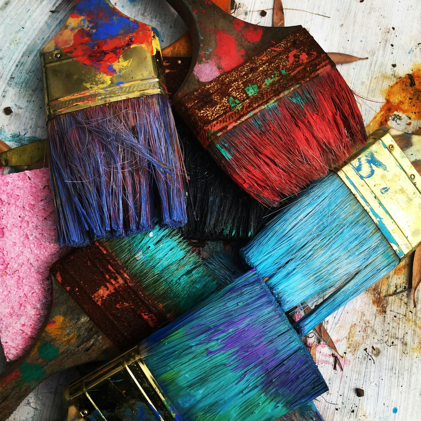
Upload the image to the Image Color Extractor. Processing stays in your browser. The file is not uploaded to ToolzWorx servers. Review swatches ranked by prominence. Expect duplicates: shadows and highlights of the same object often split into separate clusters.
Keep mid-tones for UI work. Pure white specular hits and near-black shadows rarely make good brand primaries. Merge near-duplicates by eye, then copy five to seven hex codes maximum into a working list. If you need more harmonious neighbours, feed a keeper into the Color Palette Generator and explore analogous or complementary variants.
- Prefer mid-tones over blown highlights.
- Drop muddy greys unless you need neutrals on purpose.
- Limit the core set so roles stay obvious.
Assign roles and prove readability
Map colours to roles: primary action, background, text, accent, border. Run text-on-background pairs through the Contrast Checker. A beautiful terracotta extracted from brickwork may fail as small body text on cream; keep it for large headings or buttons with a darker companion for paragraphs.
Document the final tokens with names, not only hex values. Future pages should reuse `brand-primary`, not a one-off eyedropper value from another photo.
Pair fonts to the same mood
Colour sets the palette; typography sets the voice. A refined serif heading with a neutral sans body feels editorial. Two geometric sans faces can feel modern and product-led if weights differ enough to show hierarchy. Avoid pairing two decorative families. The page will shout in two dialects at once.
Use the Font Pairing Visualizer to preview heading and body combinations with sample paragraphs. Read at a size close to production. Check that weights create clear hierarchy and that line length still feels comfortable. Two fonts are enough for most sites; add a third only for code or rare accents.
Licensing, performance, and fallbacks
Confirm font licences for web embedding. Google Fonts previews are convenient for exploration; production still needs proper imports, subsetting where appropriate, and fallback stacks (`system-ui`, Georgia, and so on) so text remains readable while files load.
Colour tokens belong in CSS variables or design tokens so a future rebrand does not require hunting hex strings across components. Keep a solid background colour behind any photographic hero so text contrast does not depend on a single unpredictable crop.
End-to-end checklist
A photo can inspire a brand, but only a cleaned palette and readable type make that brand usable on screens. Run the checklist once for your core identity, then reuse the same tokens across marketing pages and product UI so everything still feels like one system.
- Extract dominant colours with the Image Color Extractor.
- Cull duplicates and keep a small role-based set.
- Optionally expand harmony with the Color Palette Generator.
- Verify text and UI pairs in the Contrast Checker.
- Preview heading and body fonts in the Font Pairing Visualizer.
- Write tokens, licences, and fallbacks into your project.
Related tools
Use these free ToolzWorx tools alongside this guide:
More from ToolzWorx
Browse all guides, explore tools on the home page, or read About.